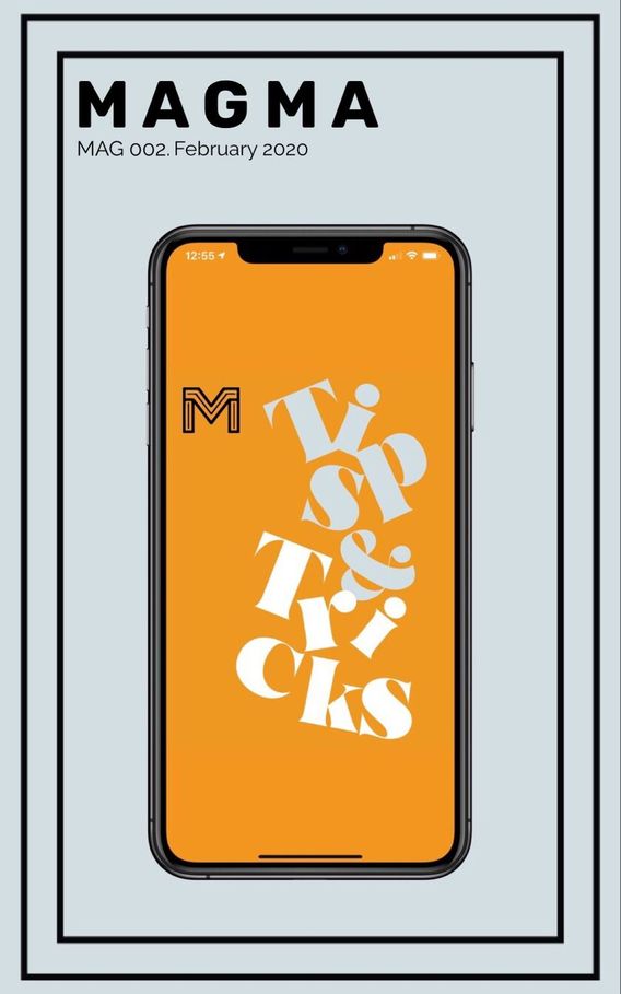
Design Tips: Dimensions, editing, & layering
1. Cover Design
We shouldn’t judge a book by it’s cover but in the case of Mags, it's quite the opposite. In the digital publishing industry, the cover is the first and most important impression.
There are two important goals when designing your Mag cover: to attract the readers’ attention and to express the content, theme, and style of your Mag.
When it comes to your cover, keep in mind that the best dimensions are 5 x 8 (1500 x 2400 pixels)
Your cover is not only what will give your audience their first impression, but it also has the most advanced design capabilities as far as our templates go. You can layer images, use the design button to add flare and dimension, add multiple text layers, switch fonts, and rotate just about everything. Let your creative mind run wild. Make your cover stand out.
2. Page Layout
The priority when it comes to legibility on Magma is the Mag page layout. This can be easily achieved with a touch of knowledge. Think of your pages as parts to story. Break the story into pages using different templates to get your points or moments across.
You may resize images without layering them, change the font size but not the actual font, and don’t fear if your images appear cropped, they’re not :) just click on them and they will enlarge
Design Tips Cont.
3. Color palette
Choose one to three colors and use them consistently throughout your Mag. Congruent color theory in your headlines, texts, and backgrounds all create the foundation for an effective Mag design and more unified look.
Get clever with your color choices and be sure to use it wisely. A blend of well-matched bright colors can make your Mag stand out but a minimal use of perhaps one or two colors softer colors can make your Mag appear classy and sophisticated. You’re in the creative drivers seat. Take your time when choosing your palette and choose colors that enhance your content rather than detract from it.
4. Digital Typography
The use of proper fonts is essential, and the typography with which words are created correctly and formatted with spaces, not only make the reading easier but also affect the positive reception of a Mag as a professional one. Just like the cover, typography has a huge impact on readability and keeping the reader’s attention
5. Insert Infographics & Pull Quotes
The building blocks of your Mag are your images and text so imagine how much more captivating combining them together into infographics will be to the readers eye. Infographics also make deeper thoughts and ideas easier to absorb and process.
Pull quotes are copies of a quote taken directly from your Mag only presented in a much larger format. You can even give the quote its own page to create a stronger impact.
6. Make Use of White Space
Although rich, meaningful content is obviously the most important thing on a page, it still needs space to breathe. Don’t feel pressured to fill up each page from top to bottom, in fact, leaving white space not only adds style to your design but draws the reader's attention to what really matters as it stands out more.
Editing tools in motion
Magma offers creators and readers tools such as customizable article and gallery templates, a variety of fonts and text colors, and the options to save multiple logos right in the platform for quick access.
In addition to these preexisting design tools, we encourage the creation of original content by using the design program of your choice and merging it with Magma.
Another great trick is to upload previously published content on your other platforms straight into Magma to increase your brand’s visibility and increase its impact.
Magma’s Interactivity
Our interactive magazine platform combines stunning visuals with rewarding user experience. Add rich media to your articles to enhance your Mag.
Add captivating videos and you will attract your readers attention by adding videos that also better express your Mag’s style and philosophy. Don’t worry, we at Magma are constantly doing our best to ensure that your photo and video content are the best quality possible.
Embedding an engaging video also creates another immersive experience within your mag. Easily drop youtube videos into your templates to add even more content for your audience. Whatever is viewed on Magma also shows as views on Youtube!
How to choose which visuals to combine with your article? Match a video to your Mag’s tone, color scheme, typography, and overall feel.
Plan Out Your Mag
Save time and maximize your execution
A content strategy improves your results and, as an added benefit, helps you allocate resources more efficiently. Because you know your content needs ahead of time, you can spot ways to improve your production process, make the most of what you have, and bring in reinforcements if you need extra support.
- Give foresight, make the process seem less and create your Mag utilizing your favorite and highest engaging and thought provoking topics, discussions, and galleries.
- Remember, there are 11 pages total: 1 is your cover and the other 10 are the maximum amount of pages allotted for each mag.
- Explore the categories within Magma and decide which one you’ll want your mag to be featured in.
- Lastly, drafts are your best friend. There is no need to rush your creative process or to feel the need to post to become relevant. Your content matters, your stories matter, your images matter - so take your time, save your work as you go, and remember you can access any saved Mag within the Drafts tab on the far right of your profile